

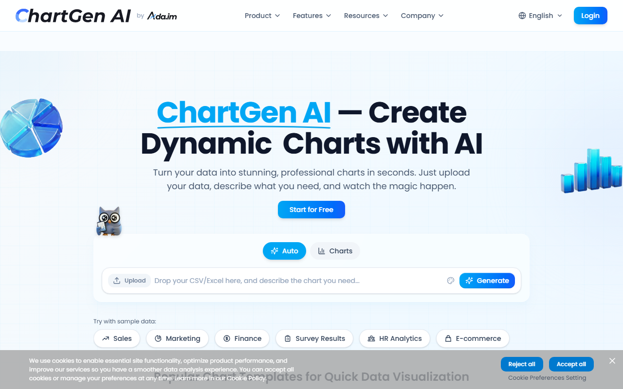
A First Look at ChartGen AI: Speed and Simplicity
Upon visiting chartgen.ai, the first thing that strikes me is the clarity of the value proposition. The homepage immediately showcases a dashboard-like interface with a prominent "Upload & Generate" workflow, a gallery of color templates such as Navy Blue and Ocean Teal, and bold statistics: over 2 million charts created, 50,000 active users, and an average generation time under five seconds. The site claims trust from 1,200 companies and high ratings of 4.8 on both G2 and SourceForge, which suggests strong user satisfaction. ChartGen is built as a core feature of Ada.im, a broader data analysis platform, but it stands alone as an AI-powered chart generator that turns raw data into professional visuals using natural language descriptions. The free tier is immediately accessible, though detailed pricing for higher tiers is not publicly listed on the website.
Building Charts with Natural Language: My Workflow Test
I tested the free version by uploading a sample CSV containing quarterly sales figures. The onboarding is minimal: you drag and drop a file or paste data, then type a request such as "show revenue by quarter as a bar chart with a trend line." Within seconds, ChartGen rendered a polished bar chart with color-coded bars and a moving average line — exactly as described. The AI automatically detected column types and selected appropriate aggregations. You can then switch between chart types (bar, line, pie, scatter, waterfall, funnel, heatmap, and combo) with a single click, and apply any of the twelve preset color templates. Export options include PNG, SVG, and PDF, which are critical for embedding in reports or presentations. The live data synchronization feature, which refreshes charts when underlying data changes, is a standout for teams tracking metrics over time. However, I noticed that the free tier limits the number of data rows you can import, and the most complex visualizations (e.g., multi-series combo charts) felt slightly slower, though still under ten seconds.
Pricing, Security, and Market Fit
Pricing is not publicly listed on the website beyond a free tier. Typical SaaS patterns suggest paid plans unlock larger datasets, advanced export options, and priority support — but without explicit numbers, budget-conscious buyers must contact sales. Security is addressed head-on: SOC 2 compliance and end-to-end encryption are highlighted, which is reassuring for enterprise users. Compared to tools like Datawrapper (focused on journalists and static charts) or Visme (geared toward full presentations), ChartGen occupies a neat niche: it is faster than manual chart builders and more specialized than full BI suites like Tableau. The main limitations are the reliance on CSV/Excel uploads (no direct API or database connectors in the free tier) and the lack of custom color scheme creation beyond the provided templates. This tool is best suited for business professionals — marketers, analysts, and managers — who need quick, good-looking charts without design or coding skills. Data scientists or those requiring advanced statistical plots should look elsewhere. Overall, ChartGen AI delivers on its promise of instant, natural-language chart generation, and the free tier is generous enough to test its real value before committing.
Visit ChartGen AI at https://chartgen.ai/ to explore it yourself.













Comments